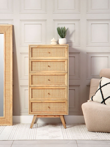
A garden room can feel entirely different once the afternoon light starts to move across it. The rattan furniture colour trends shaping 2026 respond to that changing light: warmer, quieter schemes that let natural texture do the talking, while bringing a greater sense of comfort to the rooms we use every day.
This is less about chasing a passing shade and more about choosing colours that belong in a light-filled home. Natural rattan has a warmth and character of its own, so the most successful schemes work with those qualities rather than attempting to disguise them. Think soft mineral neutrals, sun-washed earth tones, muted greens and deeper accents used with restraint.
Rattan furniture colour trends for relaxed living
The move towards calmer interiors continues, but calm need not mean pale and predictable. For conservatories, orangeries, extended kitchens and garden rooms, the strongest colour direction is layered natural warmth. It creates spaces that feel considered in bright summer sunshine and equally inviting on a grey February morning.
Warm neutrals replace stark white
Cool grey and brilliant white can make a light-filled room feel a little flat, particularly beside the golden tones and woven detail of rattan. In their place, look to oat, flax, mushroom, biscuit and soft putty. These shades have enough warmth to sit comfortably alongside natural materials, yet remain versatile when the rest of the room changes with the seasons.
On walls, a gentle off-white or warm stone shade allows the frame of a rattan sofa or occasional chair to be appreciated. For cushions, a mix of ivory, oatmeal and fine woven stripes gives depth without making the room feel busy. The result is easy-going rather than overly styled.
Earthy colours bring a room closer to the garden
Terracotta, clay, cinnamon and faded rust are appearing as accents rather than all-over statements. They are especially effective in spaces with brickwork, timber flooring or views of planting beyond the glass. A single clay-toned cushion, a throw in a softened paprika shade, or a pair of upholstered footstools can introduce welcome richness.
The key is to choose colours with a little dustiness to them. Bright orange-reds can compete with rattan's natural warmth, whereas a mellow terracotta feels settled and enduring. If your room receives strong southern light, use these shades in smaller amounts, where they can add definition without overwhelming the space.
Green becomes softer and more liveable
Green remains a natural choice for rooms that blur the boundary between house and garden, although the direction is moving away from sharp, high-contrast hues. Sage, olive, eucalyptus and lichen are more sympathetic partners for rattan furniture. They echo foliage without making the room feel themed.
A muted green fabric works particularly well on generously cushioned seating, where its softness can balance the structure of a woven frame. Pair it with warm neutrals and timber, then introduce living plants in differing leaf shapes. This layered approach feels more natural than matching every green exactly.
Deep accents add evening character
Dark colours have a place too, especially in larger rooms or those used for entertaining after dusk. Tobacco, forest green, inky blue and charcoal-brown can ground a collection of lighter pieces and make a garden room feel more connected to the rest of the house.
Use depth where it earns its place: on an occasional chair, a table lamp shade, curtains or a few cushions rather than every surface. Deep navy can look particularly handsome beside honey-toned rattan, while a softened forest green lends a more botanical, country-house feel. In a compact conservatory, keep darker shades below eye level or confine them to accessories so daylight remains the main feature.
Let the light decide the palette
Colour charts rarely tell the whole story in a room with glazing on two or three sides. Morning light can make a fabric appear cooler; late-day sun can draw out its warm undertones. Before committing to cushion covers, paint or upholstery, view samples in the actual room at several times of day.
The orientation of the space matters. North-facing rooms often benefit from creamier neutrals, honey, clay and olive to counter a blue cast in the light. South-facing rooms can carry cooler notes such as sage, chalky blue or mushroom, provided there is still a thread of warmth elsewhere. East- and west-facing spaces tend to change character most dramatically, making balanced mid-tones an adaptable choice.
Flooring should be part of the decision, too. Pale stone, oak, terracotta tiles and painted boards will each influence how rattan and fabric colours read. Rather than selecting every element separately, place samples together on the floor and look at them as a small composition.
Cushions are where colour becomes personal
The beauty of a rattan frame is its staying power. Its natural finish provides a consistent foundation, while cushions give you the freedom to alter the mood of a room over time. This makes colour a considered layer, not a commitment that needs replacing whenever tastes shift.
For a restful, all-year scheme, choose a main cushion fabric in a warm neutral, olive or gentle mineral blue. Add texture through a boucle-style throw, linen-look cushions, a subtle check or a narrow stripe. Variation in weave and scale is more interesting than introducing lots of competing colours.
If you prefer a more expressive room, let one accent shade lead. A terracotta scatter cushion can sit alongside smaller details in faded red or rose, while olive seating might be paired with moss, tobacco and natural cream. Keep the rattan visible between these layers. Its pattern and warmth are part of the room's visual rhythm, not simply a background to cover.
For homes that host family gatherings or regular garden-room lunches, practicality deserves equal weight. Mid-toned fabrics are often more forgiving than very pale covers, particularly near doors leading outside. Removable, well-made cushion covers also make seasonal refreshes feel achievable rather than wasteful.
Choosing colours that will still feel right in years to come
Trends are most useful when they help you recognise a direction you already enjoy. A home furnished for relaxed living should not be rebuilt around a colour forecast every year. Start with the permanent elements - the rattan, flooring, windows and larger upholstered pieces - then introduce personality through textiles, artwork and small decorative details.
A useful rule is to work with three families of colour: a calm base, a natural mid-tone and one deeper or warmer accent. For example, oat, olive and clay; or chalk, honey and inky blue. This gives the eye enough contrast to create interest, without fragmenting a room that should feel restful.
Consider how the space joins the rest of your home. An orangery off a painted kitchen may benefit from picking up a softened version of the kitchen colour in its cushions. A garden room opening onto a planted terrace might call for tones drawn from the surrounding bark, stone and foliage. Continuity is often what makes an extension feel like a genuine part of the home.
Beyond a single season
The most enduring rattan furniture colour trends favour materials and shades with a sense of place. Natural rattan will gently develop its own character over the years, and that is part of its appeal. Colours with warmth, depth and a slightly softened quality tend to age alongside it more gracefully than anything overly crisp or heavily fashion-led.
At Desser, we have long believed that furniture for light-filled spaces should be chosen for how it supports everyday life: slow mornings with the paper, an impromptu supper, a quiet place to sit as the garden changes outside. Choose the colours that make you want to spend more time there. That is usually the shade worth keeping.